
Design principles
A "designed" room isn't luck or budget — it's nine rules working quietly in the background. Here's each one, how to apply it in a real Indian flat, and the exact numbers to use.
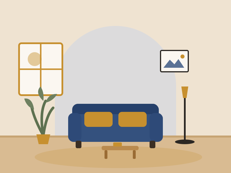
Nine principles, one calm room
You don't need all nine at full volume. Get colour ratio, scale and lighting right and 80% of the job is done — the other six are how you take a room from "fine" to "finished". Each principle below has three parts: what it is, how to apply it in an Indian flat, and a quick example with real numbers.
1. 60-30-10 colour
The ratio that stops a room looking either flat or chaotic.
2. Scale & proportion
Right-sizing furniture and art to the room, and to each other.
3. Focal point
The one thing the eye lands on when it enters the room.
4. Balance
Formal symmetry vs relaxed, informal balance — and when to use each.
5. Layered lighting
Ambient + task + accent, at the right colour temperature.
6. Negative space
The empty room your furniture needs to breathe.
7. Texture & pattern
Depth without colour — and how to mix prints safely.
8. Rule of three
Why odd-numbered groups always look more natural.
9. Visual weight
Reading the "heaviness" of objects so a room feels settled.
The 60-30-10 colour rule
What it is. Split a room's colour into three roles: a dominant 60%, a secondary 30%, and an accent 10%. The ratio is what makes a scheme feel intentional instead of either washed-out (one colour everywhere) or busy (five colours fighting).
How to apply it in an Indian flat. Your 60% is the big, hard-to-change surfaces — walls, floor tiles/wood, the sofa or bed. Keep these calm: warm white, greige, oatmeal, or a soft indigo. The 30% is the supporting cast — curtains, an accent chair, the rug, bedding, a feature wall. The 10% is the fun that changes with the season — cushions, art, a brass diya or urli, ceramic vases, throws. Because the 10% is cheap and swappable (₹300–2,000 a piece), it's where you carry festival colour without repainting.
Quick example. A 3BHK living room: warm-white walls + oatmeal 3-seater + light oak TV unit (60%), indigo cotton curtains + a jute rug (30%), and ochre cushions, a mustard throw and one brass wall piece (10%). Swap the ochre for deep red at Diwali and the whole room reads festive for under ₹1,500.
Build the exact palette with our palette helper, or see full schemes in colour combinations.
The split, at a glance
Rental tip
Can't paint? Make the 60% your existing white walls and shift the personality into the 30% (a bold rug and curtains) and 10%. You still get a designed scheme with zero deposit risk.
Scale & proportion
What it is. Scale is how big something is relative to the room; proportion is how pieces relate to each other. The most common reason a room feels "off" — even with nice furniture — is that something is the wrong size.
How to apply it in an Indian flat. Indian 2BHK living rooms are often 3.3–3.8 m wide. A 240 cm L-shaped sofa in a 3.4 m room leaves no walkway and swallows the space; a 180–200 cm 3-seater is the sweet spot. On the flip side, don't float a dainty 90 cm loveseat on a big wall — it looks lost. The fixes below are the ratios designers keep in their heads.
| Pair | The rule | Real number |
|---|---|---|
| Sofa vs room width | Leave a walkway; sofa ≤ ~60% of wall | 180–200 cm sofa in a 3.3–3.8 m room |
| Coffee table vs sofa | About two-thirds of sofa length | 110–130 cm table for a 180 cm sofa |
| Coffee-table height | Level with, or up to 5 cm below, seat | 40–45 cm high |
| Sofa-to-table gap | Reachable but with legroom | 40–45 cm |
| Art over sofa/bed | Two-thirds to three-quarters of furniture width | 120–150 cm of art over a 180 cm sofa |
| Art hanging height | Centre at eye level | Centre at 145–150 cm from floor |
| Rug under living seating | At least front legs on the rug | 170×240 cm min; 200×300 cm ideal |
| Rug under dining | Extends past pulled-out chairs | +60 cm beyond table on all sides |
| Pendant over dining | Hang above the tabletop | 75–90 cm above the table surface |
Quick example. A 6-seater dining table (about 180×90 cm) needs a 240×150 cm rug under it so chairs don't catch the edge, and a pendant hung so its base sits 75–90 cm above the tabletop — high enough to clear sightlines, low enough to pool light on the food.
Measure before you buy
Tape the footprint of a sofa or bed on your floor with masking tape and live with it for a day. It costs nothing and saves a ₹40,000 mistake. See our full clearances guide in measurements & spacing.
The focal point
What it is. Every room needs one clear hero — the spot your eye lands on first. Without it, the eye wanders and the room feels restless. With two competing heroes, it feels tense. One focal point per room; everything else supports it.
How to apply it in an Indian flat. Pick the natural hero for the room and commit: the living room TV/media wall (or a large artwork), the bedroom headboard wall, the pooja unit, a big window with a good view, or a single feature wall. Then arrange seating to face it and aim your accent lighting at it. The classic Indian mistake is making the TV and a busy gallery wall and a bright showcase all shout at once.
Quick example. In a compact bedroom, make the headboard wall the focus: a fluted MDF or upholstered panel (₹6,000–15,000), two matching pendant/wall lights, and nothing competing on the opposite wall. The eye settles the moment you walk in.
Good focal points by room
- Living: media wall or one large artwork
- Bedroom: headboard / feature wall
- Pooja: the mandir unit itself
- Kitchen: backsplash or island
- Any room: a window with a view
Rule: one hero per room. If two things compete, demote one to a supporting role with quieter colour and less light.
Balance & symmetry
Balance is how evenly "visual weight" spreads across a space. There are two kinds, and Indian homes use both.
Formal (symmetrical)
Mirror-image arrangement around a centre line: matching lamps on two identical bedside tables, two same sofas facing each other, a pooja unit flanked by identical brass diyas.
Feels: calm, formal, ceremonial. Best for: pooja rooms, master-bed headboard walls, traditional and modern-luxe formal living.
Informal (asymmetrical)
Different objects that weigh the same visually. A tall plant on one side of the sofa balanced by a stack of two framed prints plus a table lamp on the other.
Feels: relaxed, collected, lived-in. Best for: boho, Scandinavian, Indian-contemporary and most everyday family rooms.
Quick example. A console in the entryway: formal version is a mirror centred with two matching lamps and two identical vases. Informal version is the mirror shifted left, one tall lamp on the right, and a low bowl of keys plus a short stack of books on the left — different objects, even weight. Both are balanced; pick the mood you want.
Vastu note (optional)
Symmetry sits naturally with vastu's love of the centred, undisturbed brahmasthan. If it matters to you, keep the room's centre clear and reserve formal symmetry for the pooja and main entry. Treat this as optional guidance, not a rule.
Layered lighting
The single biggest upgrade most Indian homes can make. One tube-light or one bright ceiling fixture flattens everything. Good rooms use three layers.
Ambient
General fill — ceiling lights, cove/LED strips, downlights. The base layer you switch on first.
Task
Focused light where you work — reading lamp, under-cabinet kitchen strip, mirror light, study lamp.
Accent
Mood and drama — wall washers on art, a picture light, uplights behind a plant, diya glow.
Colour temperature (Kelvin) is everything. This is where most homes go wrong — cool white (6500K) makes a living room feel like a clinic. Use warm 2700–3000K everywhere you relax, and reserve neutral white only for task zones.
| Room / zone | Colour temp | Rough target |
|---|---|---|
| Living room (ambient) | 2700–3000K warm | ~150–300 lux, on a dimmer |
| Bedroom | 2700K warm | Low + a reading task light |
| Reading / study task | 3000–4000K | ~500 lux at the desk |
| Kitchen counter (task) | 3500–4000K neutral | Under-cabinet LED, ~500 lux |
| Bathroom mirror | 3500–4000K | Light beside, not just above |
| Pooja room | 2700–3000K warm | Soft glow + diya, never harsh |
Quick example. A ₹8,000–12,000 living-room lighting scheme: keep the existing ceiling light but put it on a 3000K bulb and a ₹500 dimmer module, add a floor lamp beside the sofa (task), and a small clip/picture light on your art (accent). Three switches, three moods, from one flat room. When you buy bulbs, check the box says 2700K/3000K "warm white" and matches across the room — mixed temperatures look messy.
Negative space & breathing room
What it is. Negative space is the deliberate emptiness around and between objects. It's not "wasted" space — it's what lets the eye rest and makes the pieces you do have look considered. A room that's 100% full reads as cluttered no matter how nice each item is.
How to apply it in an Indian flat. Small flats tempt you to line every wall with furniture and fill every shelf — resist it. Leave roughly 30–40% of each shelf and surface empty. Keep clear walkways: 75 cm minimum, 90 cm comfortable for main paths, and at least 60 cm to squeeze past. Float one piece off the wall if the room allows — a single gap of empty floor makes the whole space feel bigger.
Quick example. A TV console styled with three objects and two-thirds of the top left bare looks far richer than one crammed edge to edge. Same for a bookshelf: mix books lying flat, a small plant and one object per shelf, and let the gaps do the work.
Clearances to protect
- Main walkway: 75–90 cm
- Squeeze-past path: ≥ 60 cm
- Chair pull-out at dining: 90–100 cm
- Sofa to TV: 2–2.5× screen diagonal
- Leave ~30% of shelves empty
Texture & pattern mixing
Texture is how you add richness without adding colour — vital for calm, neutral Indian-contemporary and minimalist rooms that would otherwise feel flat.
What it is. A room needs a mix of surfaces — rough and smooth, matte and shiny, hard and soft — to feel layered. Aim for at least three or four textures in view: say jute (rug), cotton or linen (cushions), warm wood (table), and a metal or ceramic accent (brass, terracotta).
How to mix pattern safely. Patterns fight when they're the same size. The fix is to vary the scale: pair one large pattern (a big block-print or ikat), one medium (a stripe or small geometric), and one small (a fine dot or texture-weave). Give them a shared colour so they read as a family, and keep roughly two-thirds of the soft furnishings solid so the eye has somewhere to rest.
Quick example. On a plain oatmeal sofa: one large ikat cushion, one medium ochre stripe, one small indigo-dot, plus two plain textured covers — all sharing the indigo/ochre thread. Add a jute rug and a chunky-knit throw and the neutral sofa suddenly has depth. Materials to reach for in India: jute, cane, cotton dhurrie, block-print, brass, terracotta and mango wood.
The rule of three (odd numbers)
What it is. Objects grouped in odd numbers — three, five, seven — look more natural and dynamic than even, matched pairs. Our eye reads an odd group as "arranged" and an even one as "lined up". It works because odd groups can't split neatly, so the eye keeps moving.
How to apply it in an Indian flat. Style surfaces in threes and vary the height, shape and texture within each group: tall–medium–short, arranged in a loose triangle, not a straight row. A coffee table tray, a console top, an entryway shelf, a plant corner — all improve instantly. (The exception is deliberate formal symmetry, like two matching diyas flanking the mandir — there, pairs are the point.)
Quick example. A console: a tall vase or leaning artwork (tallest), a stack of two books topped with a small brass box (medium), and a short trailing plant (lowest) — three heights, triangle layout, one shared metal accent. Reads styled, not staged.
The triangle test
- Group in 3 or 5, not 2 or 4
- Vary heights: tall / medium / short
- Arrange in a triangle, not a line
- Mix shapes: round, tall, flat
- Repeat one material to unify
Visual weight
The invisible principle behind balance. Every object has a "weight" your eye feels — get it evenly spread and the room feels settled; clump it in one corner and the room tips.
Reads as heavy
- Dark colours (charcoal, deep indigo, teak)
- Large, solid, tall pieces
- Glossy, reflective or dense surfaces
- Busy patterns and bold texture
Reads as light
- Pale colours, whites and neutrals
- Small, low, leggy furniture
- Glass, cane, open frames, sheers
- Plain surfaces and empty space
How to apply it. Spread the heavy things around the room instead of stacking them in one zone. If a dark teak wardrobe and a dark bed sit on the same wall, the room leans that way — balance it with something visually substantial opposite (a tall plant, a large mirror, a bold art piece). Legs help: a leggy sofa or a glass-top table lets light and floor show through, so a small room feels airier than the same footprint in a solid, skirted piece.
Quick example. A heavy dark-wood TV unit on one wall balanced by a large framed artwork plus a tall floor plant on the far side — different objects, matched weight. That's informal balance (Principle 4) doing its job through visual weight.
Do & avoid checklist
The nine principles distilled into a walk-around you can do in five minutes.
Do
- Keep 60% of the room calm; carry personality in the 10%
- Tape furniture footprints on the floor before buying
- Hang art with its centre at 145–150 cm
- Give the room one clear focal point
- Use 2700–3000K warm bulbs in living/bed spaces
- Layer light: ambient + task + accent, on dimmers
- Keep walkways 75–90 cm and shelves ~30% empty
- Style in threes, at varied heights, in a triangle
- Spread visual weight evenly across the room
Avoid
- Five equal colours with no clear dominant
- An oversized sofa that kills the walkway
- Small art hung too high, floating alone
- Two or three focal points competing at once
- A single 6500K cool tube-light flattening the room
- Mixed bulb temperatures across one space
- Furniture pushed against every wall
- Same-scale patterns clashing with no shared colour
- All the heavy, dark pieces on one wall
Put the principles to work
These rules are the "why". The guides below are the "how" — with pairings, exact measurements and ready-made schemes.
What goes with what
Pairing woods, metals, fabrics and finishes that actually work together.
Colour combinations
Ready-made 60-30-10 schemes for Indian homes.
Measurements & spacing
Every clearance and dimension in one place.
Palette helper
Build your dominant / secondary / accent split.
Find your style
Six looks, from Indian-contemporary to modern-luxe.
Budget estimator
Cost a whole room, piece by piece, in rupees.
More from the design guide
Colour Combinations for Indian Homes
Colour theory, light-and-direction rules, accent-wall dos and don'ts, and 10 ready-made palettes with hex — built for Indian light, flats and budgets.
What Goes With What
Match walls, furniture, flooring, metals and fabrics with confidence — matrices, style specs and copy-paste recipes.
Materials & Finishes
The honest reference on woods, fabrics, countertops, metals and floors — durability, climate notes and rupee-aware picks for Indian homes.